AIM: Within this section, I will be analysing the advertisement poster for Charlie Chaplin's Modern Times.
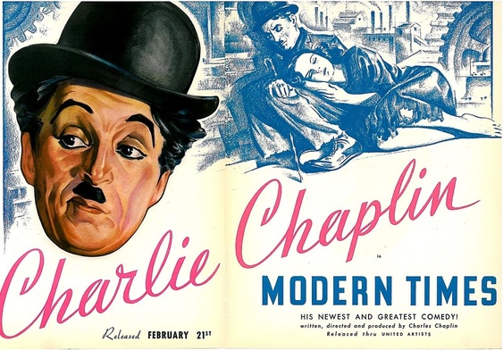
This poster is a very simple poster because of the times. Unlike modern posters, this poster is handdrawn. In the centre of the poster is an image of Charlie Chaplin and his name in large letters. From this, I can infer that Chaplin intended to interpolate his audience with fame. By this, I mean that the fact that Charlie Chaplin is the star of the film would attract a large audience because of his fame during the times. In terms of mise en scene, although the poster is simple, the cogs in the background imply the location in which it is set which is a factory and the class of people which it focuses on which is working class. In front of this is an image of the famous character "The Little Tramp". This character is one of Chaplin's most famous and influencial characters. This image once again interpolates a large audience because people are familiar with the character and enjoy watching the character. In terms of the representation of this image, I can infer that the fact that the "Little Tramp" is sleeping in front of the factory represents the failure of modernity. It could be a comment on society. The image itself reflects the working class and therefore would appeal to those of the working class, however, Chaplin was very popular with everyone in those days and although the poster connotes working class, the fact that Chaplin's face is so prominent in the poster would interpolate everyone else.
The name United Artists on the poster would attract an independent or niche audience. In comparison to Modern day posters, there are no reviews on the poster and no age restrictions. The fact there is no age limit also broadens the viewers of the film.
The name United Artists on the poster would attract an independent or niche audience. In comparison to Modern day posters, there are no reviews on the poster and no age restrictions. The fact there is no age limit also broadens the viewers of the film.
HOW THIS LINKS TO MY POSTER: I have incoporated a lot of these film poster aspects in my poster targetted at a "film literate" audience. One of my protagonists are in the centre of the poster, unlike Chaplin's poster, my actors face will not be shown because, instead of interpolating my audience through fame or recognition, I am representing gangsters or the downfall narrative of a gangster as a whole. In addition, My characters names are larger than the title, as is Chaplin's. Furthermore, my poster is going to be simple and the focus will be on the baggy trousers hanging from the protagonist's bottom and the hand cuffs to give a hint of what is to be expected within the film. In terms of my target audience, I interpreted the poster in a way that would show comedy for example the bubble font and manipulated it with the black and white textured background and the handwritten title font (similar to the font Charlie Chaplin's name is in). However, unlike Chaplin's poster I incorporated a couple of reviews to make it a bit more appealing for the time (modern as opposed to 1936).
| poster_analysis_for_modern_times_by_charlie_chaplin_ocr_g324_gabriella_pollard.docx |
