ART WORK TEST
AIM: Within this section of my blog, I will be evaluating my photography and explaining why I chose the photos I did for my poster.
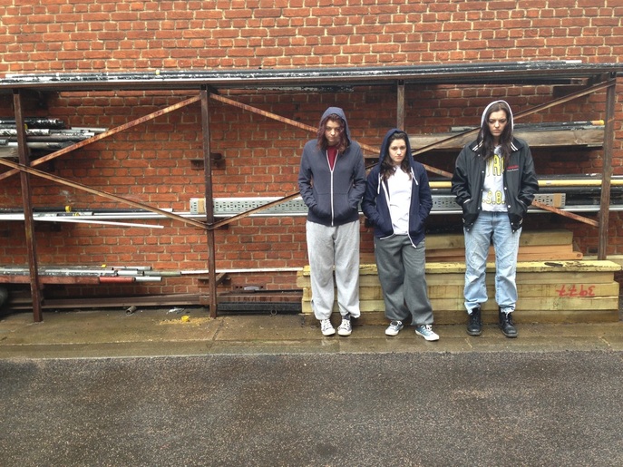
The image above was to be my second poster image. However, I felt that the protagonists were to far and therefore portrayed as less intimidating. In addition, I didn't like differences in their stances and felt the image looked messy because of this. Furthermore, I didn't like the fact that there was a huge difference in their costumes and therefore thought a close up of their faces would look better.
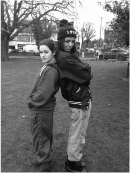
With the image above, I felt that it didn't look very professional because the location didn't show the background of the protagonists and the characters didn't look intimidating enough. Also not all of my characters were present.
