Test Design
AIM: Within this section I will be discussing the process in which I created my posters.
OBJECTIVE: I will achieve my aim by discussing the fonts I used, how I overlaid images onto my original, how I implemented my certificate etc.
OBJECTIVE: I will achieve my aim by discussing the fonts I used, how I overlaid images onto my original, how I implemented my certificate etc.
POSTER 1:
Firstly, I started off with a simple image of my protagonist.
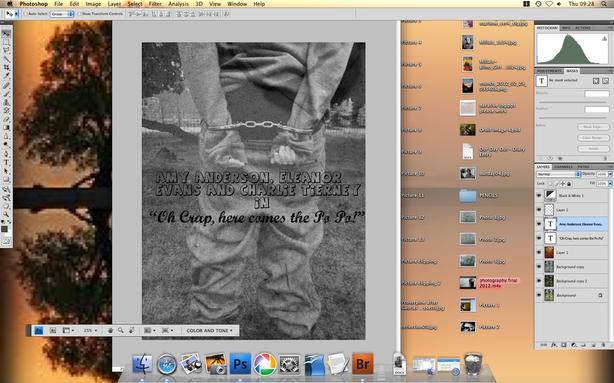
My first poster was aimed at a more film literate audience, so an audience that would perhaps typically go and see a Chaplin film. As my film is in black and white I wanted the poster to reflect that, so I changed the background image (original colour) to black and white on Photoshop. I then felt the colour was too dark so I changed the brightness and contrast of the image to make it clearer.
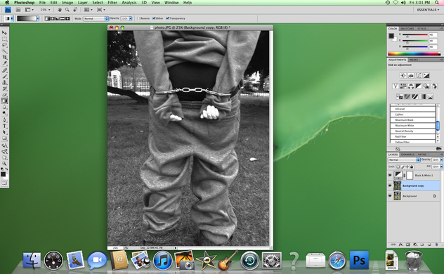
To then give my poster an "old effect", I used the internet to learn how to overlay an image onto another. Added a layer of textured paper onto Photoshop and then overlaid the image onto my "background image". I then played with the contrast, brightness and the fading to get the consistency I wanted.
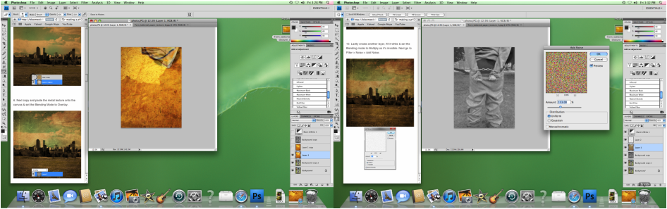
After this, I once again used Google to explore different fonts that I could use for my poster. I wanted two opposing fonts, one which expresses the comedy and another which shows the fact that it's based on an old film. I then downloaded the fonts and overlaid them onto my film poster.
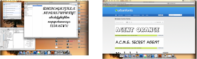
I then decided on where to place my fonts and then changed the font colour and size.
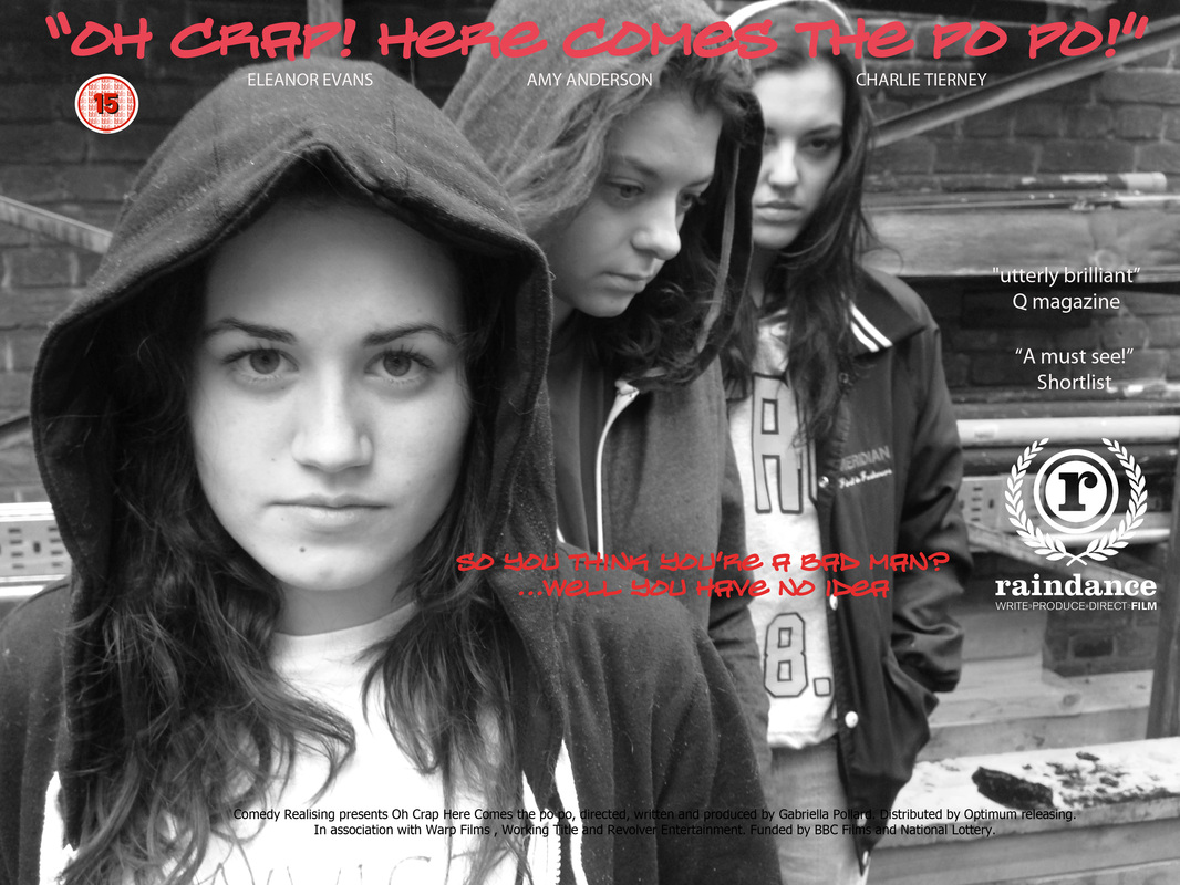
POSTER 2:
For this poster, I started off with a simple landscape photo which included all three of my protagonists.
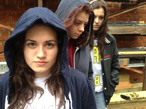
I then put the photo in black and white on Photoshop and played with the brightness and contrast.
After this, I went on Dafont to find a font which represents "gangsters", I therefore looked up graffiti fonts.
After this, I went on Dafont to find a font which represents "gangsters", I therefore looked up graffiti fonts.
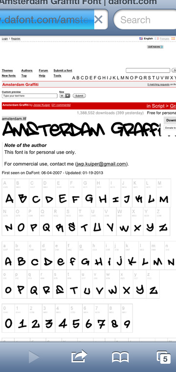
I then downloaded the font, overlaid it onto my background image and changed the colour. I chose red because I wanted to present the following connotations: blood, violence and I wanted the font to stand out. I then positioned the font in an appropriate place.