AIM: Within the mock up section of my blog, I will be identifying how I interpolated my audience through the use of visual and linguistic codes.
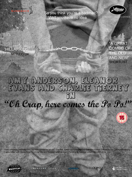
For this poster, I chose to add textured paper over the top of the original image to give it an "old" feel. In addition, I showed the comedy through the image itself because it is a satirical representation of what gangsters are represented as, especially to an older audience, thus interpolating my more film literate audience. In addition, the use of industry logos for example warp and uk film council, add value to the film as well giving away the fact that it is an independent company. Furthermore, the chosen font was influenced by the font used on the modern times poster because I wanted to replicate certain parts of it to link the two films in terms of their genre. In addition, the bubble writing used expresses the fact that this film is a comedy.
